
Once connected to the EBM semantic model (dataset), you can build visuals with consistent measures, dimensions, and security.
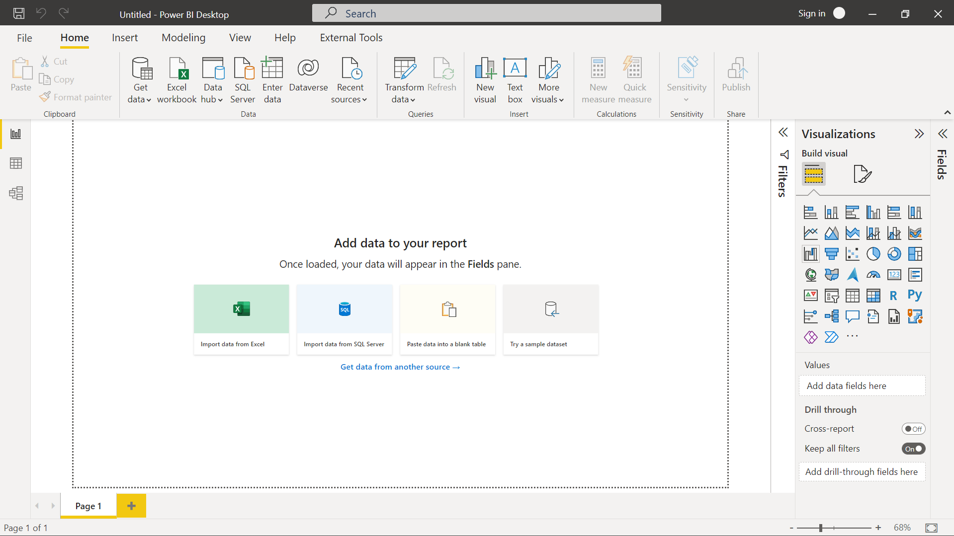
Once connected to your EBM workspace and Catalyst dataset, you can design custom Power BI reports tailored to your business needs. This guide covers best practices for layout design, visual selection, performance optimization, and saving your work.
Important: EBM Support can verify dataset health and refresh frequency but does not provide Power BI design support. For design tutorials and DAX guidance, refer to Microsoft's Power BI Learn Portal.
Report Building Workflow
Home → Get Data → Power BI Datasets → Select EBM semantic model
Sketch which metrics and dimensions to display, organize by pages/tabs
Drag fields into visuals, apply filters, format for clarity
Preview with different filters, verify calculations, check performance
Save .pbix file with clear naming convention to OneDrive or SharePoint
Creating Your Layout
The Fields pane contains all dimensions and measures from your Catalyst dataset. Use drag-and-drop to build visualizations quickly.
Basic Building Blocks
📊 DimensionsWhat they are: Categories and hierarchies for grouping data Examples:
Use in: Axes, slicers, filters, legends |
📈 MeasuresWhat they are: Calculated values and aggregations Examples:
Use in: Values, tooltips, conditional formatting |
🎯 Prebuilt ItemsWhat they are: EBM-defined calculations and hierarchies Benefits:
Tip: Use prebuilt measures instead of creating redundant calculations |
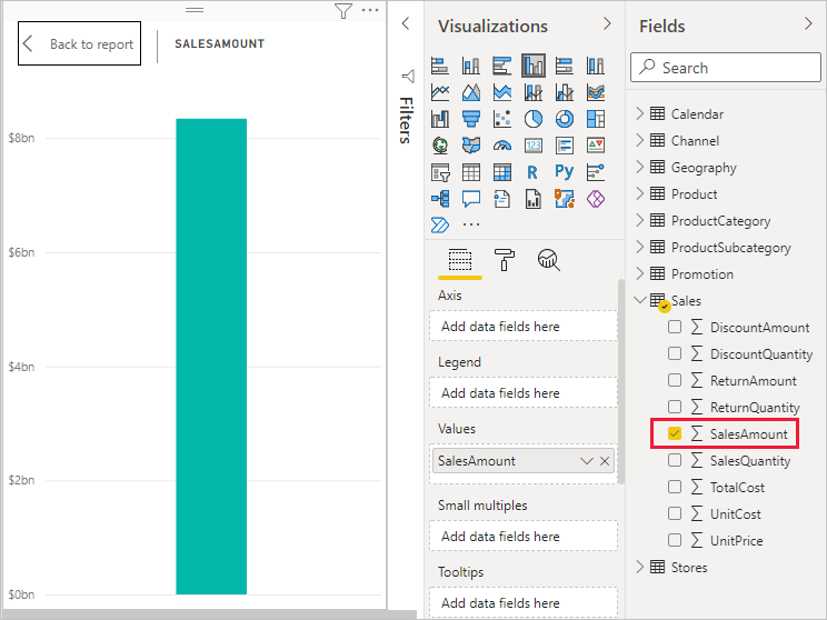
Example: Building a Sales Trend Chart
- Select Line chart from the Visualizations pane
- Drag Period dimension to the X-axis
- Drag Total Sales measure to the Values field
- Add Scenario to Legend for Actual vs. Budget comparison
- Apply a Company filter if needed
- Format the chart title, colors, and data labels

Recommended Visualizations by Use Case
| Visual Type | Best For | Example Use |
|---|---|---|
| Card | Single KPI display | Total Sales, Current Month Revenue, Profit Margin % |
| Table / Matrix | Detailed financial statements | P&L by department, detailed sales by customer |
| Line Chart | Trends over time | Monthly revenue growth, quarterly sales patterns |
| Bar/Column Chart | Comparisons across categories | Sales by region, top 10 customers, product performance |
| Pie/Donut Chart | Part-to-whole relationships | Revenue by product category, market share breakdown |
| Slicer | Interactive filtering | Date range selector, company filter, scenario toggle |
| Gauge | Progress toward goal | YTD revenue vs. annual target, utilization rate |
| Map | Geographic analysis | Sales by state, customer locations, regional performance |
Organizing Reports with Pages
Use multiple pages (tabs) to create logical sections within your report. This improves navigation and keeps individual pages focused.
📋 Page 1: Executive Summary
- Key metric cards (Revenue, Margin, etc.)
- High-level trend charts
- Year-over-year comparisons
💰 Page 2: Profitability Analysis
- Gross margin by product
- Cost breakdown tables
- Profit margin trends
📊 Page 3: Detailed Data
- Transaction-level tables
- Customer detail matrix
- Drill-through capabilities
💡 Tip: Use consistent naming conventions for pages and visuals to make reports easier to navigate. For example: "01_Overview", "02_Sales", "03_Finance".
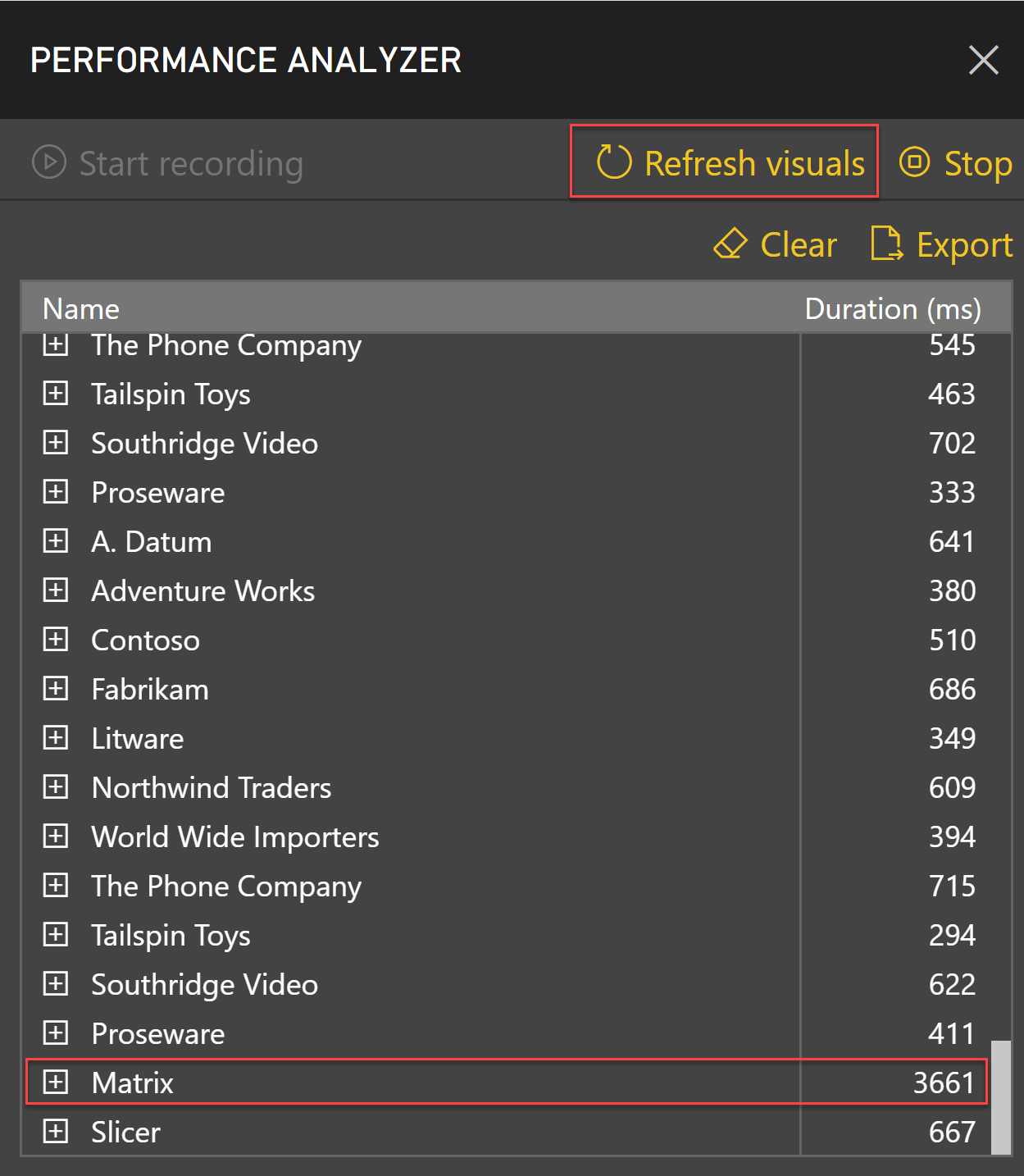
Performance Optimization Tips
⚡ Keep Reports Fast
✅ Do This
|
❌ Avoid This
|
Working with Filters and Slicers
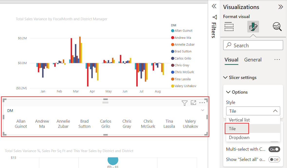
Filters and slicers allow users to interact with your report dynamically. Understanding filter scope is critical for proper report behavior.
Filter Levels
| Visual-level | Affects only the selected visual | 🔵 |
| Page-level | Affects all visuals on the current page | 🟢 |
| Report-level | Affects all visuals across all pages | 🟠 |
Slicer Best Practices
- Date Range Slicer: Use for time-based filtering (fiscal year, quarter, month)
- Dropdown Slicer: Best for dimensions with many values (customer list, item codes)
- Button Slicer: Ideal for binary choices (Actual vs. Budget, Current vs. Prior Year)
- Hierarchy Slicer: Use for nested categories (Region → State → City)
Formatting for Professional Reports
🎨 Design Checklist
Visual Consistency
- Use consistent color themes across all pages
- Apply the same font family and sizes
- Align visuals to a grid for clean layout
- Maintain uniform spacing between elements
Data Clarity
- Add descriptive titles to all visuals
- Include data labels where appropriate
- Use conditional formatting to highlight exceptions
- Format numbers consistently (currency, percentages)
User Experience
- Add tooltips with additional context
- Include instructions for complex interactions
- Use bookmarks for navigation shortcuts
- Test report on different screen sizes
Accessibility
- Use high-contrast colors for readability
- Add alt text to visuals for screen readers
- Ensure text is legible at default zoom
- Avoid relying solely on color to convey meaning
Saving and Versioning Your Work
Proper file management ensures you can recover previous versions and collaborate effectively with your team.
File Naming Convention
Recommended Format:
[Department]_[ReportName]_[FiscalYear]_v[Version].pbix
Examples:
Finance_Profitability_FY25_v1.pbixSales_CustomerAnalysis_FY25_v2.pbixExecutive_MonthlyDashboard_FY25_v3.pbix
Storage Best Practices
✅ Recommended
|
❌ Not Recommended
|
⚠️ Important: Save your work frequently. Power BI Desktop does not have autosave, and unsaved work will be lost if the application crashes.
Testing Your Report
Before publishing, verify that your report works correctly with different data scenarios.
Pre-Publish Testing Checklist
- ☐ All visuals load without errors
- ☐ Filters and slicers affect the correct visuals
- ☐ Calculations return expected results
- ☐ Date ranges display correctly
- ☐ Cross-filtering works between visuals
- ☐ Drill-through actions navigate properly
- ☐ Tooltips show relevant information
- ☐ Report performs acceptably (loads in under 5 seconds)
- ☐ All page names are descriptive
- ☐ Visual titles are clear and accurate
Next Steps
Once your report is built and tested, you're ready to publish it to your EBM workspace. The next article covers the publishing process and ensuring your report appears correctly in Power BI Service.
✅ Report completed → Proceed to Publishing Reports to the EBM Workspace
💡 Need design help? → Visit Microsoft Power BI Learn Portal
📧 Technical issues? → Contact EBM Support
Building effective Power BI reports on Catalyst data requires balancing functionality with performance. Use the EBM dataset's prebuilt measures and hierarchies, organize reports with logical pages, and limit visuals to maintain speed. Apply consistent formatting, save files with clear version numbers to OneDrive or SharePoint, and test thoroughly before publishing. EBM Support assists with dataset and connection issues, but for Power BI design and DAX help, consult Microsoft's learning resources. Once your report is complete and tested, you're ready to publish to your EBM workspace.
Comments
0 comments
Article is closed for comments.